Lorenzo Dal Dosso
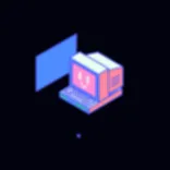
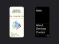
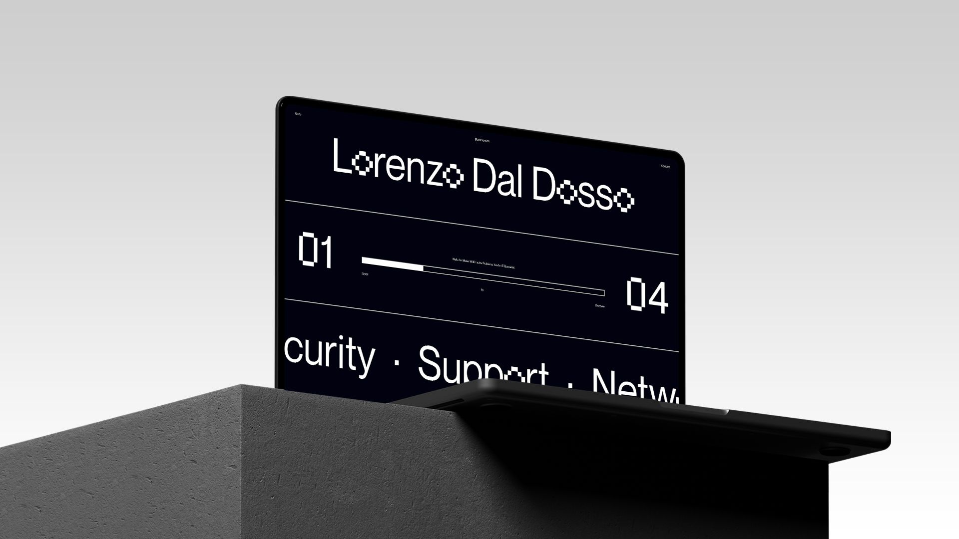
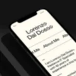
Cleanliness and clarity are the keywords of the entire experience. The first output from our discussion with Lorenzo were a logo and coordinated image that fully reflect his personality. The minimal design, in this case, is combined with a custom font that visualizes Lorenzo's work as well as illustrations that narrate his passions.
role
- Creative Direction
- Art Direction
- Branding
- Visual Design
- Motion Design
- Development


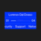
Everything starts from a pixel, or a bit. This is where we started to think about Lorenzo Dal Dosso's identity and how best to represent it, following both his profession and his hobbies. The result was a custom font that we used first of all to create his brand and then to visualize the website’s copy.






For the incredible help with illustrations and motions, many thanks to our friends at Rocketpanda.


